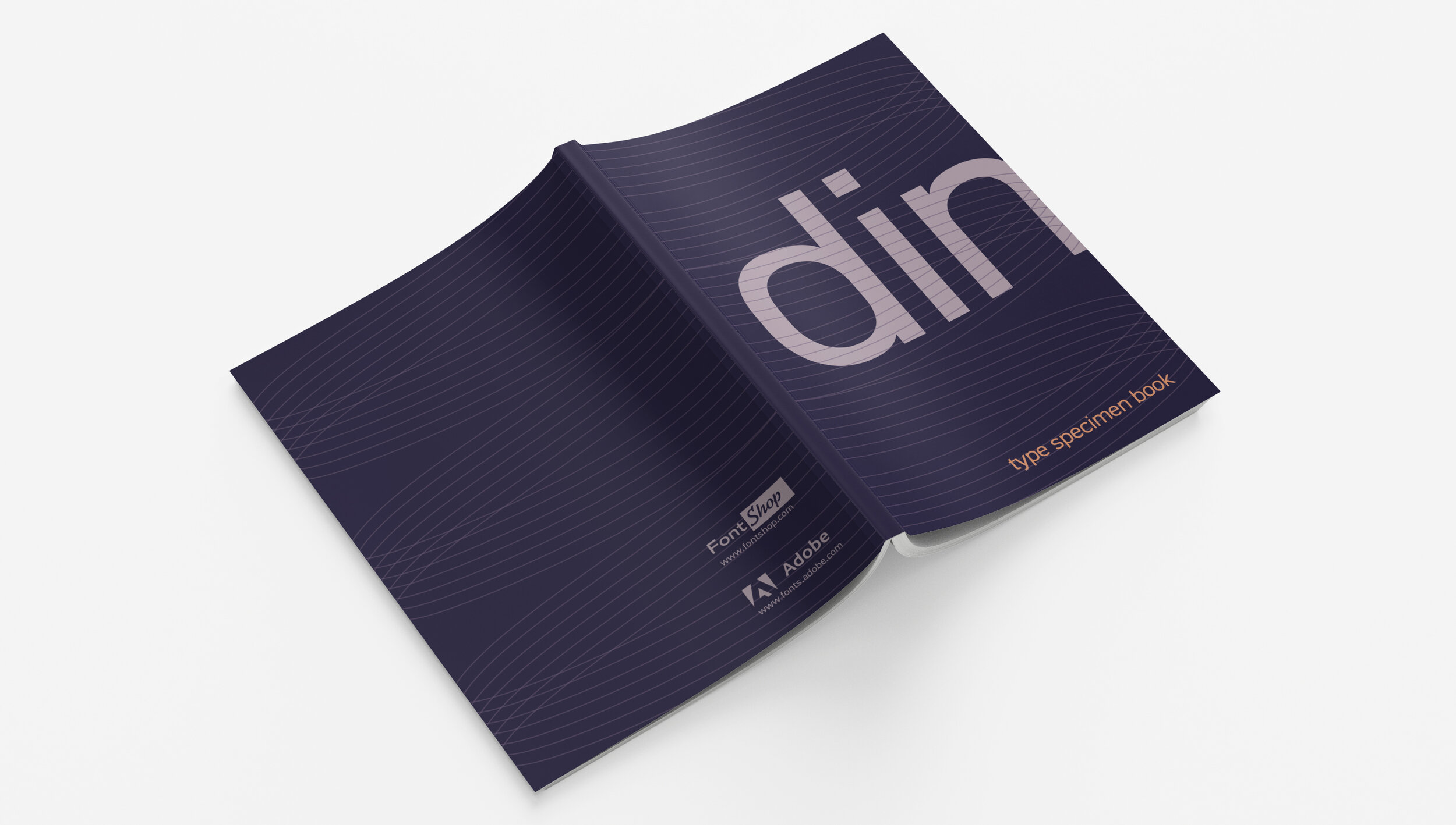
DIN
Print, Motion
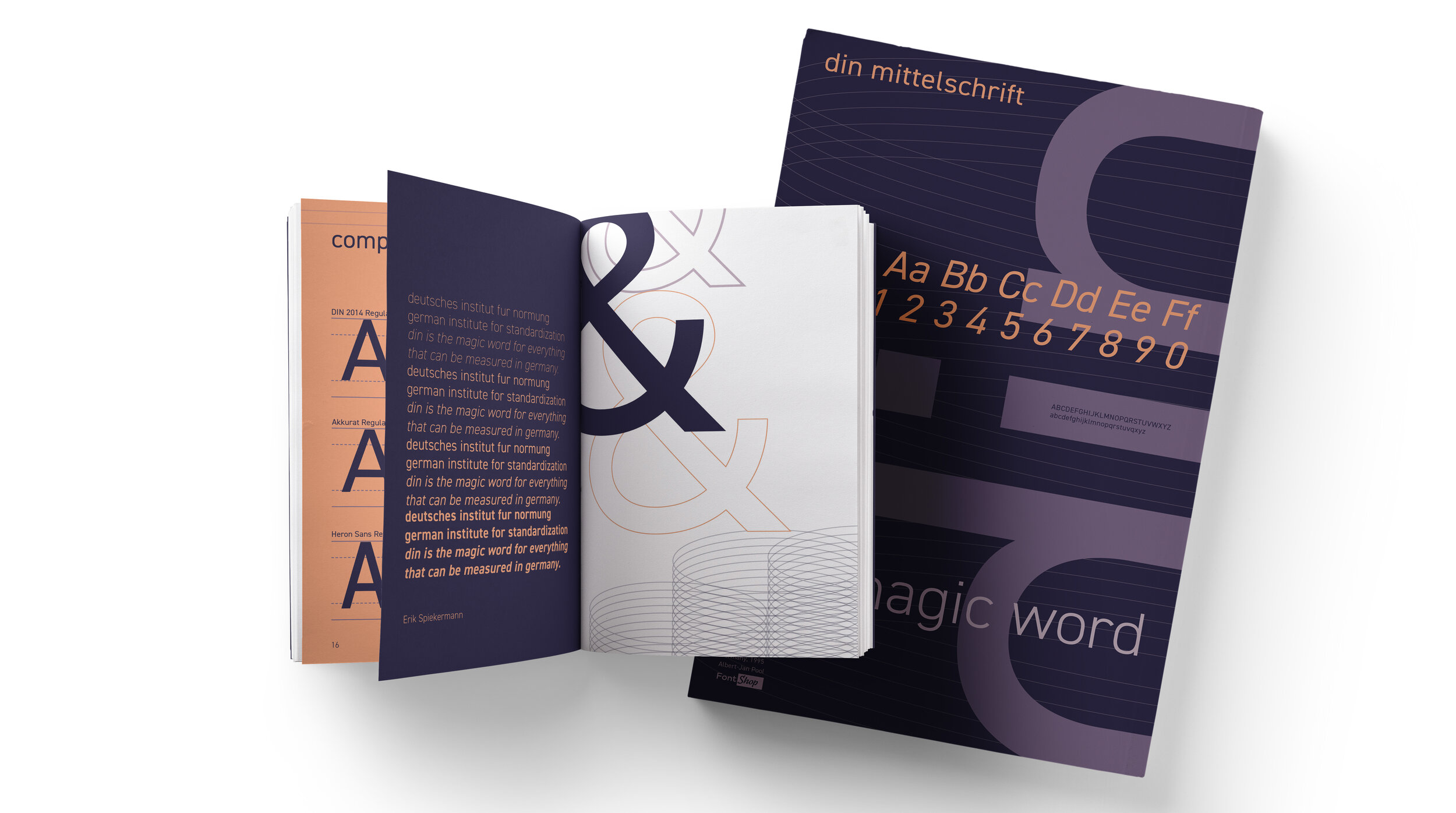
OBJECTIVE: Research different typefaces for specimen and design a small-medium sized specimen book, along with a poster which advertises the typeface to an audience of graphic designers, as well as an accompanying motion piece.
PROJECT STATEMENT: My chosen typeface was DIN. DIN stands for “Deutsches Institut für Normung”, which in english translates to the German Institute for Standardization. There are many versions out there, but I focused on Albert-Jan Pool and FF DIN. My concept was to go back to its roots and highlight the fact that this typeface is a very technical one. It was originally created with a grid, so I created a few different graphics that I felt portrayed a technical look.
TOOLS: InDesign, Photoshop, Illustrator, After Effects
— Project for Savannah College of Art and Design


